Monday, 31 October 2016
Contents page: Consolidating my research
Contents page 2 - How this research has affected my creativity
- I really like the purple banner and large white text. I will use a colours banner so that the text and fonts will stand out and attract a larger amount of people.
- I like that the magazines page numbers and information are text wrapped in 4 Columbus. This is a very good idea as it is keeps the paragraphs and articles clean and easy to read. I will use this in my final design.
- I also like how there is a small image from the front cover on the contents page. I will also use this design aspect to help link the front cover and the contents page so that the reader would understand the main genre of the magazine more.
Contents page 3 - How this research has influenced my planning
- I like how to width of the columns are equal, because it creates symmetry in the text which is ascetically pleasing to the reader. I will use this in the design of my product as my magazine will need to be very ascetically pleasing to the target audience. I will also use equal Columbus as it helps set out the text in clear writing.
- I also like how to numbers showing which pages the articles are on are highlighted in a different colour helping them stand out. From this contents page I have learnt that to help highlight the page numbers which link to the magazine I will need to use a bright colour such as bright red and bright yellow.
- I like how the photos have page numbers on, so that the reader doesn't have to read a large amount of text to find out where the artist on the photo is in the magazine. I will use this aspect when desiging my contents page as it helps create less fuss towards the reader.
Front cover: consolidating my research
Front cover 1 - How this Research has Influenced my Planning and Creativity
- I like the style and font used in this magazine, I will use a variety of fonts such as sans and sans serif to appeal to a wider target audience and help it become funner and more engaging.
- I also like the rebellious atmosphere given from the red and black colour scheme. From this research I could break conventions of a classical music magazine and create a more rebellious theme, which would open up my magazine to a wider target audience and help attract a younger age of customers.
Front cover 2 - How this Research has Influenced my Planning and Creativity
- I really like the fonts and the colour scheme. It is very engaging and easy to read. This is a very good idea as in my magazine I will need to make my text as easy to read as possible.
- I also like the position of the model and the prop that she has in her hand, when I design my main magazine, I will use this idea of a prop so that the image doesn't look as bland and boring.
Front cover 3 - How this Research has Influenced my Planning and Creativity
- I really like the way the main title "Lady Gaga" is hidden behind the star as a type of identification, when designing my main magazine I could use this to help the ascetics and become more eye catching to the reader.
- I also really like the idea of the text "Move over Madonna..." as this will appeal to a younger audience. This is a very good idea, although I will not be using this technique as it does not suit the classical music magazine theme. The way the letters are text wrapped around the body is really interesting and unique. I will use text wrapping so that my magazine will make it easy for the reader to know exactly who the model is as the name fits around them in clear writing.
- I like the kerning and the way some spaces are huge and others are much closer between letters. I will be using this technique to develop my magazine as it will help separate text.
Front cover 4 - How this Research has Influenced my Planning and Creativity
- I really like how the magazines background colours have help the model and text stand out. This technique will be used when designing my magazine as I want my magazine to be very engaging and eye catching.
- I really like the way this magazine has designed its masthead and text on the front cover.
- I also really like the way the articles are set out on the left hand side of the page. This aspect will be used in my final design as it provides a clear space of the front cover for the information about the articles on the magazine.
Front cover image location

 This photo was taken outside in the cold winter while the model was sat on a park bench. This is suitable for the genre as it provides a white colour scheme. The lighting is natural helping the models face brighten and look cleaner.
This photo is taken in a photo shoot infront of a dark brown woodern door with low lighting everywhere apart from the models face. The lighting is very dark which helps the model stand out with her red violin and black and red dress. The lighting is only on the models face helping identify her as the star of the magazine.
 This photo was taken inside in an opened glass area with pale goldern colours and a white floor. This is a very good location for the front cover of a classical music magazine as pale colours create a quiet calming atmosphere. The pale background also helps the text and star stand out as they are bright engaging colours.
The photo was taken against a wall with the star sat on a wooden bench. It was obviously taken outside with studio lights. The lighting creates a nice clean look on the stars face. Overall the background is quite bland which creates an eye catching front cover.
 This photo was taken inside with the star sat at a black and white stripey chair and table booth with a dark brown back and a large hole in it where you can see brighter colours and lights. It uses mainly natural light from outside the window but it slightly highlighted at the back of the seat. The table is a glossy black which provides a reflection from the model.
How this has helped me with my photo shoot :
- It has given me ideas of how to place my model- How the atmosphere changes with a model looking into the camera compared to them not
- what props I could give to the model to hold
Research DPS 2 - Thinglink
 How has this research influenced my planning and creativity
 How has this research influenced my planning and creativity
- I really like the colour scheme of black, white, grey and pink.
- I like how at the beginging of the text there is a large letter D, helping bold out the writing.
- I like how the text is set out in a Q&A theme.
- The border around the dps is very bright and eyecatching.
Friday, 21 October 2016
Research- checking out my chosen masthead
I have checked out my masthead name and nobody has used it before.


TA research 1 mastheads
My TA research has shown that my original choice was the right one. I asked 26 people aged 16-18 which masthead they preferred and 9 chose the font I liked.
This is my chosen masthead and font.

This is my chosen masthead and font.

Planning Masthead

- This font would suit my genre choice and i like the symbolic sign [Barthes] of the top hat. I could use this visual sign to make the magazine more funky and take a photo of my male model wearing the top hat in a jaunty way.
- I could also use the top hat icon to create synergy - it could be bullet points and form a shape behind my page numbers.

- This font is not going to be noticeable in Tesco etc.


Thursday, 20 October 2016
Research DPS 1

Double Page Spread analysis - what i learnt from this:
- I need to consider the type of language I use for my TA.
- Taking shots from a low angle to create mood.
- I like the splatter - this is better for a younger TA
Tuesday, 18 October 2016
Content page research 3

This is a contents page from a classical magazine. This contents page gives me a lot of ideas for photos and the overall layout of my magazine.

 There are many photos of different artists which are featured in the magazine. Each of these are different close up and long range shots. The largest one in the middle is a medium close up and the model is not looking directly into the camera, breaking conventions as most classical magazine models are looking directly into the camera. However, a lot of the images follow the classical genre conventions as one of them has classical musical instruments and some use the same colour theme of black and white. In a lot of the images on the contents page there are 3 with men, all of these men have their hands up, showing sophistication and dominance. This could help attract a younger generation as a lot of young teens find power and dominance in photos very "cool". all of these photos suit the Richard Dyer theory of image, this is when a model is made up to suit the genre/theme. In addition, this is a "Q" magazine. "Q" is always mainly involved with reds, blacks and white colours which give the impression of perfection towards the reader.
 The different fonts used in the magazine are serif for the subtitles and for the text under the subtitle there is a sans serif font. As well as this, the subtitles are in bold, highlighting and helping catch peoples eye. In addition, next to the paragraphs there are red page numbers. The red colour helps the text stand out to the reader as it is the only red colours on the page.
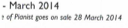
In the bottom right corner of the contents page there is an image advertising the "pianist" (classical) website. This is used to advertise the classical music genre further. Fitting the classical theme well and does not look out of place.

The text is set out into columns, separating it, providing a clear presentation of the text and information about whats inside the magazine. There is no text wrapping because this contents page is quite classy and it would not be appropriate as this appears to an older audience.

 As well as this, the magazines contents page has a date and total number of pages on it, this will be important to me when i am manufacturing my own magazine as i want to provide as much information as possible.
 How this research has influenced my planning
I like how to width of the columns are equal, because it creates symmetry in the text which is ascetically pleasing to the reader.
I also like how to numbers showing which pages the articles are on are highlighted in a different colour helping them stand out.
I like how the photos have page numbers on, so that the reader doesn't have to read a large amount of text to find out where the artist on the photo is in the magazine.
Classical Music Instruments Moodboard
 All these images are related to the classical genre, therefore being ideal for my photo shoot.
I will be using the violin as it is a main instrument which comes to mind when thinking about a classical music genre magazine.
Monday, 17 October 2016
Contents page research 2
Contents page analysis 2 from AlexanderSherrattASmedia
I really like the purple banner and large white text.
I like that the magazines page numbers and information are text wrapped in 4 Columbus.
I also like how there is a small image from the front cover on the contents page.
I really like the purple banner and large white text.
I like that the magazines page numbers and information are text wrapped in 4 Columbus.
I also like how there is a small image from the front cover on the contents page.
Initial Ideas Creativity Post
Firstly, the genre I have chosen is classical music. I have chosen this because there is a gap in the market, which opens me up to a wider target audience. Most classical music magazines try and attract mainly older, middle aged, upper class people. I could break conventions and attempt to attract a younger target audience and help the classical music genre grow in popularity.
Furthermore, from the research I have gathered from the front covers, I have been able to come up with a large amount of ideas which I could potentially use for my final product. Such as; I use different text boxes for different letters of the masthead to allow the text to overlap and look more modern and popular, Due to it being a classical magazine I will also use colours like black and white but I will use reds or colours which contrast the blacks and whites, helping it to break conventions.
Secondly, from my contents page research I have learnt that I will need to relate it to the front cover as they are the two main sections of the magazine. The masthead will be positioned at the top left corner (same as the front cover) but in a smaller image. This is to show brand identification and to suit the house style. On the contents page I will be using a wide range of photos of different models as It will create a wider range of information for the reader to learn about and improve the overall design of the magazines internal area.
In addition, from collecting the magazine, front cover, dps and contents page i found that the masthead of a music magazine is very important as it shows brand identity and helps catch the readers eye, helping your magazine to become more popular. The masthead usually relates to the overall genre of the magazine. As I have chosen classical I will need to come up with something relating to the classical music genre and theme.
As well as this, I will be using Sam Moverley as my model. He will be wearing a plain white shirt, black jeans, a red tie and smart shoes. This is a popular style of clothing from what I have seen in other existing classical magazines. I have asked him to wear a red tie as it breaks conventions from similar existing magazines which only contain black and white. When we have our photo shoot I am going to take as many photos as I can to help create a wider range of images, maybe 25-50 so that I could find the best one and use that for my magazine. After the photo shoot I will be making a mood board of all the photos which I have taken. I will also make a questionnaire with the photos i have taken so people will have to give their choice on which photos I should use when designing my magazine. From the research I gathered on classical music magazines I have realized that alot of the photos and images are set in very bright lighting which helps to bring out the models face. I will be using this technique as it will help my model look more professional and high standard, and in colour. Usiing colour may break conventions as it is not just a plain black and white magazine like all of the other classical magazines.
Also, in the bottom right corner i will use a bar code and an advertisement. This will help my magazine become more popular at a quicker pace. The advertisement will give advantages to both the webite i will be advertising and to me as it may open my magazine up to a wider target audience.
Monday, 10 October 2016
Wednesday, 5 October 2016
Front Cover Analysis 4
 This is a front cover of a classical music magazine, this specific genre is the one I could possibly use for my main magazine.
 Furthermore, the colours used for the front cover magazine are different shades of brown and tanned colours. These colours help create (get information about brown and what it creates) In addition, the magazines text is white, overall helping the text to stand out from the brown background. The model in the front of the magazine is dressed in white white top which is tucked into a black skirt and has brown hair and a slightly tanned face. These colours relate to its genre as they provide an atmosphere of a calming and traditional classical music genre.
 Also, the model is positioned central in the front cover and is opening doors into a hall and is pictured looking very happy and smiling. The photographer has taken this photo like so that it shows classcial music with a fun atmosphere. The model is also very attractive. This would attract a younger age audience as young teens/adults would buy a magazine because of an attractive lady on the front. Linking to Laura Mulveys theory of male "gaze", as the lady looks very attractive so that the male audience may buy the magazine.
The fonts used in this magazine are sans serif and Serif. These types of fonts are used alot in media as they are very clear and stand out well. The main titles have been set in bold, again helping them to stand out and catch the readers eye.
 In the magazine the producers have used the words "standingup for music" this shows that this classical magazine is about Nicola Benedetti trying to help create a larger fan base for the classical music genre.
At the top of the magazines front cover there there is text showing the date and the price of the magazine. This is a very good idea as it provides the reader with information about what the date is and how much for
How this Research has Influenced my Planning and Creativity
- I really like how the magazines background colours have help the model and text stand out.
- I really like the way this magazine has designed its masthead and text on the front cover.
- I also really like the way the articles are set out on the left hand side of the page. (I will mostlikley use this design for my main magazine)
Tuesday, 4 October 2016
Front Cover research 3
 This is a music magazine front cover for Lady Gaga.
Colours and Contrast
Firstly the colours used for the front cover of this magazine are red, black, white and grey. these colours contrast dramatically. The colour red is a visual sign [Barthes] and mainly associated withe energy, war, determination, power as well as desire and courage. Red also has a large effect on the body as it is also associated with love, compassion and danger. Black is mainly associated with power, elegance, formality, death, evil and mystery. Due to the colour black being associated with mainly danger and evil, black is seen with mainly fear of the unknown and usually has a negative connotations although in some cases it shows strength, authority, and is a prestigious colour. White is a very bright and engaging colour which associates with light, goodness, innocence and purity and is considered as the colour of perfection.
Model
 The magazine front cover has Lady Gaga stood very revealing to the reader. She is positioned in the center of the page, with long gloves on her hands placed over her nipples with no top on, and the other glove between her legs. Furthermore, this front cover fits with Laura Mulvey's theory "male gaze" of media text being created for the eyes of a heterosexual male. The front cover suits Laura Mulvey's theory as it has a very revealing photo of Lady Gaga who is an attractive female star.
However, Lady Gaga likes to do these types of photo shoots to show she is very powerful. In one of her concerts Lady Gaga turned up in a meat dress. In some ways this photo could be taken as an act of power due to her powerful figure and stance, which goes against Laura Mulvey's theory. In addition from the clothes Lady Gaga is wearing and the stance she has taken also suits Julian McDougals theory of online audiences changing. "in the online media age it is getting harder to conceive a media audience as a stable identification" for example if Lady Gaga had made this magazine for the elderly generation she would have had more clothes on. This magazine is obviously made for the younger generation. The model is also the main part of the magazine as she is the only one in the front cover and is in front of a lot of text.
Text/Fonts


 The fonts and text used on a magazine front cover are very important as they are the main part of a magazine which catches someones eye. A lot of the text "Lady Gaga" is behind her. This is done because a lot of people know who she is so they don't need to read the text to know its her. As well as the main text being "Lady Gaga" underneath that is says "has risen" This gives a main story to the magazine.
For a few years Lady Gaga had taken a break due to having a child so her music wasn't as popular as it used to be.
The fonts used in this magazine are sans and sans serif. These fonts are used alot in magazines as they are clear and eye catching. Also, many of the headings have bold and italic fonts, allowing the text to become even more bold and easy to read.

How this Research has Influenced my Planning and Creativity
- I really like the way the main title "Lady Gaga" is hidden behind the star as a type of identification.
- I also really like the idea of the text "Move over Madonna..." as this will appeal to a younger audience
- the way letters are split round the body is really interesting and unique.
- Plus - on the bottom left.
- I like the kerning and the way some spaves are huge and others are much closer between letters.
Saturday, 1 October 2016
Front Cover Research 2

Colour and Contrast
Firstly, the magazine uses a dark background and white writing. This has been designed like this to help the text and headings stand out, catch›ing the eye of a potential buyer or someone walking past. The white, bright text and model contrast against the dark background, creating a calm, relaxing atmosphere. The use of these colours are also simple but very effective as a technique to catch the readers eye when walking past. As well as this, the model is wearing bright white clothing and has blonde hair and white teeth. These features of the model help the magazine front cover to stay with the overall theme of black and white. Due to the star having a nice, calming and happy atmosphere, it creates the effect of a beautiful angel.
Text/Fonts

 Text is very important when designing a front cover to a magazine. In this magazine they have used white text allowing it to stand out more to the reader. The masthead of "ClassicalMUSIC" helps tell the reader what the article is about. I like the way the magazine has designed the masthead with each letter in different text boxes so that each letter overlaps the other slightly, i could use this in my front cover when designing the front cover to my magazine. In addition, they have used the title of "vocal futures" using this as a main title on the front cover of a classical music magazine is showing that the magazine is about young people portraying classical music in the future (young stars). The text underneath this subheading says "can Suzi Digby turn young people on with bach?" this obviously relates to the model as it is the main article on the front cover and is positioned right next to the models head and neck. From the words "turn young people on" opens the magazine up to a younger target audience. I could use this as a template to help attract the same younger generation as a target audience for my magazine front cover. In the bottom right of the magazine are small articles which relate to what is inside the magazine. They have used small bold headings and small text underneath showing that the are not as important as the main title and text. The designer has set out the small articles in central rows beside the bar code and logo.
 Also, the fonts used in this magazine is sans serif and used bold around the titles of small articles. Fonts are very important when used in the front cover of a magazine. The text used is very clear and fits well with the simple theme of the magazine It works very well with the colours used aswell. It is a lot easier to read then other classical music magazine fonts such as Brush Script MT Italica.
Model/Positioning
 Furthermore, the model has been positioned towards the left half of the magazines front cover and takes up 1/3rd of the magazine. She has golden blonde hair with bright white teeth. Also she is wearing white bright clothing and holding a baton to conduct a classical band. Due to her having bright blonde golden hair and smiling with very white perfect teeth and holding a silver sparkly baton, gives the magazine a calming heaven like atmosphere.
 Prices and marketing techniques
Finally, in the top right corner of the magazine there is a price next to the date which shows the potential buyer how much the magazine costs.
As well as this, the front covers main article and text is at the top 1/3rd of the magazine. This is a marketing technique as on shop shelves when a magazine is being sold it other magazines are placed infront of them, causing 2/3 of the magazine unfortunately not being shown to someone walking past. If they designed the magazine so that it has the main parts at the top of the magazine people walking past would be more likely to be persuaded to buy the magazine.
How this Research has Influenced my Planning and Creativity
If the position of the model and the prop that she has in her hand.
Subscribe to:
Comments (Atom)