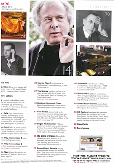
This is a contents page from a classical magazine. This contents page gives me a lot of ideas for photos and the overall layout of my magazine.
 There are many photos of different artists which are featured in the magazine. Each of these are different close up and long range shots. The largest one in the middle is a medium close up and the model is not looking directly into the camera, breaking conventions as most classical magazine models are looking directly into the camera. However, a lot of the images follow the classical genre conventions as one of them has classical musical instruments and some use the same colour theme of black and white. In a lot of the images on the contents page there are 3 with men, all of these men have their hands up, showing sophistication and dominance. This could help attract a younger generation as a lot of young teens find power and dominance in photos very "cool". all of these photos suit the Richard Dyer theory of image, this is when a model is made up to suit the genre/theme. In addition, this is a "Q" magazine. "Q" is always mainly involved with reds, blacks and white colours which give the impression of perfection towards the reader.
 The different fonts used in the magazine are serif for the subtitles and for the text under the subtitle there is a sans serif font. As well as this, the subtitles are in bold, highlighting and helping catch peoples eye. In addition, next to the paragraphs there are red page numbers. The red colour helps the text stand out to the reader as it is the only red colours on the page.
In the bottom right corner of the contents page there is an image advertising the "pianist" (classical) website. This is used to advertise the classical music genre further. Fitting the classical theme well and does not look out of place.

The text is set out into columns, separating it, providing a clear presentation of the text and information about whats inside the magazine. There is no text wrapping because this contents page is quite classy and it would not be appropriate as this appears to an older audience.

 As well as this, the magazines contents page has a date and total number of pages on it, this will be important to me when i am manufacturing my own magazine as i want to provide as much information as possible.
 How this research has influenced my planning
I like how to width of the columns are equal, because it creates symmetry in the text which is ascetically pleasing to the reader.
I also like how to numbers showing which pages the articles are on are highlighted in a different colour helping them stand out.
I like how the photos have page numbers on, so that the reader doesn't have to read a large amount of text to find out where the artist on the photo is in the magazine.

A much more proficient level 3 post here Alex. Keep going - this is much better. You are starting to use terminology but you must:
ReplyDeleteAdd the comment beneath
How this research has influenced my planning and creativity